

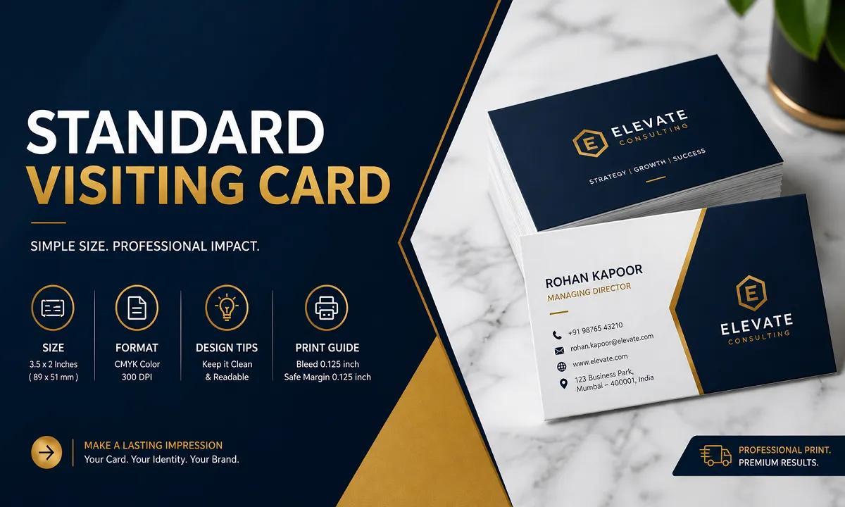
Modern standard visiting card design with correct size, format and professional print layout
Even today, when everything is going digital, a standard visiting card still holds real value. Think about it — when you meet someone for the first time, handing over a clean and well-designed visiting card feels much more personal and professional than just sharing a phone number.
From what we’ve seen in real printing projects, a good visiting card is not just about contact details — it’s about the impression you leave behind. That’s why understanding the right standard visiting card size, format, and design really matters.
In this guide, I’ll walk you through everything in a simple way so you can create a visiting card that actually looks professional and works for your brand.
What is the Standard Visiting Card Size?
Let’s start with the basics. The most commonly used standard visiting card size in India is:
9 x 5 cm
3.5 x 2 inches
90 x 50 mm
1050 x 600 pixels (at 300 DPI)
This size works so well because it easily fits into wallets and doesn’t feel too big or too cramped. It’s a perfect balance.
If you’re designing your card on tools like Canva or Photoshop, just make sure you set the resolution to 300 DPI. This small step makes a big difference in print quality.
Understanding the Format (Bleed, Margin & Safe Area)
Now here’s something many people ignore — the format.
Even if your size is correct, a wrong format can mess up your final print.
Bleed (3mm): This is extra space around your card. It helps avoid white edges after cutting.
Safe Margin (3–5mm): Keep your text and logo inside this area so nothing gets cut off.
Layout:
Front → Logo, name, tagline
Back → Contact details
Keeping things structured like this makes your standard visiting card look neat and easy to read.
Simple Design Tips That Actually Work
You don’t need a complicated design to make a great visiting card. In fact, simple designs usually work better.
Here are a few practical tips:
Keep it clean: Don’t try to add too much information
Use easy-to-read fonts: Fancy fonts often reduce readability
Stick to your brand colors: This helps with recognition
Give space to your design: White space makes everything look premium
Add a QR code (optional): Great for linking your website or portfolio
A well-designed standard visiting card should feel balanced, not crowded.
Printing Tips You Shouldn’t Ignore
Before you send your card for printing, double-check these basics:
Use CMYK color mode (not RGB)
Keep 300 DPI resolution
Export in PDF format
Add 3mm bleed
For paper types:
Matte → simple and professional
Glossy → more vibrant
Textured → premium feel
If you’re not sure, it’s always better to consult a professional visiting card printing service or designer.
Standard vs Custom Visiting Card
A lot of people ask — should you go for a custom size?
Here’s the honest answer:
Standard visiting card: Practical, affordable, easy to carry
Custom visiting card: Creative, unique, but sometimes less convenient
From real experience, most businesses still prefer the standard visiting card size because it just works everywhere.
What Should You Include in Your Visiting Card?
Keep it simple and useful.
Front side:
Logo
Your name
Job title or tagline
Back side:
Phone number
Email
Website
Address
That’s it. No need to overload it.
Common Mistakes to Avoid
Let’s quickly talk about what NOT to do:
Adding too much text
Using low-quality images
Ignoring bleed and margins
Poor color contrast
Wrong size setup
These small mistakes can make your card look unprofessional.
Quick FAQs
What is the standard visiting card size in India? → 9 x 5 cm (90 x 50 mm)
What resolution should I use? → 300 DPI for best print quality
Can I use a custom size? → Yes, but standard size is more practical
Final Thoughts
At the end of the day, a standard visiting card is more than just a card — it’s a small piece of your brand.
A clean, well-designed card can leave a strong impression, even after a short meeting. And honestly, that’s what really matters.